so, as i'm printing out the photos for the donner mine music camp (95 8x10s total... i'm on the 5th set of 10. whee. what a fun night.) i was able to get the dimensions for the center chunk of the bag in order to figure out the size and such... well, that was all fine and dandy until i got to the point of picking a photo to use for suzanne's bag. the first photo is a sample of the colors so you can get an idea. the shades of black print will be used for the pocket, as well as the stripes to the sides of the photo, and as well around the back side stripes. the turquoise will be used for all other pieces. the band across the top, the strap, the lining, and all remaining triangles. i've narrowed it down to three photos, for three very different reasons. so here are the photos, with their detailing as to the issue of why i can't choose. (here starts the 6th set of 10 photos printing) here we have the bag fabric. the turquoise has a gold speckle to it, as well as a few varying shades of the color, and the black has a slight texture look to it so its not so "blah" mind you, i tried going to turquoise fq's as well, but once i found this fabric, there was no turning back
 photo option number one - grayscale on the grass... (i just named it that) this was my original pick. i like how there is no color that would clash with the turquoise on the bag, as well as its more of a casual photo of suzanne and erick.
 option number two - hands and jeans in color. i like the simplicity of this photo, and the connection between the two of them, even though all you see is hands. i think this one would go nicely on a bag, without having any faces staring back at you :)
 photo option number 3 - smiling faces in sort of a "retro tone" as we use in picture people lingo - i like how this one isn't the complete full color, and has a deeper tone to it. you see both their faces, and a nice happy expression... and most of all, you also see the ring in this one :)
(oh goodness... is that a hair elastic i spot on suzanne's wrist? in her engagement photos? silly girl) here we have the bag fabric. the turquoise has a gold speckle to it, as well as a few varying shades of the color, and the black has a slight texture look to it so its not so "blah" mind you, i tried going to turquoise fq's as well, but once i found this fabric, there was no turning back
 photo option number one - grayscale on the grass... (i just named it that) this was my original pick. i like how there is no color that would clash with the turquoise on the bag, as well as its more of a casual photo of suzanne and erick.
 option number two - hands and jeans in color. i like the simplicity of this photo, and the connection between the two of them, even though all you see is hands. i think this one would go nicely on a bag, without having any faces staring back at you :)
 photo option number 3 - smiling faces in sort of a "retro tone" as we use in picture people lingo - i like how this one isn't the complete full color, and has a deeper tone to it. you see both their faces, and a nice happy expression... and most of all, you also see the ring in this one :)
------
so there are the three choices...

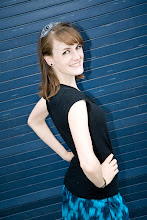
i'm so bummed that my overall favorite picture of suzanne and her man will not fit, because that would be a hands down, no questions asked choice. :) for your viewing pleasure, here it is ---->
i could make it fit, but it would lose the overall cuteness of the photo. her shoe would get cut off, and i think that's a huge part of what makes this photo one of my favorites. suzanne has always had cute shoes. oh. i swiped all these photos from her facebook, so i know on the bag its going to probably have a slight grainy quality to them, but i think that won't detract from the bag at all.
thanks for looking, and please, any input on the three photos would be great. and more than just a "i like number _" i'd love more of a detail as to why i should go with your vote :)
I think the faces staring back at you from a bag is a little creepy so I like the idea of using a pic where they are looking at each other rather than at the camera. I feel like the hand holding is a cute picture but a little impersonal and since the whole point of doing this is to personalized it for the bride you should most def. go with Picture A. and there you have it.
ReplyDeleteoh good. so far one person agrees with my first choice pick :)
ReplyDeleteunfortunately, the other bride i have not only doesn't have any engagement photos up, but also might be a search of her facebook for photos of the two of them together that would work well on a bag... :/